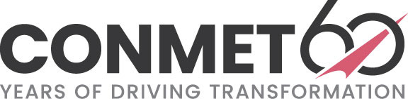
ConMet had their 60 year anniversary and my manager and I were tasked with creating a logo for the year long celebration. We researched the history of the company original logo and found the arrow had slightly changed over the years, we pulled the original sketch for the arrow. Playing off the arrow and the 60 we were able to come up with a great solution that everyone loved. This logo incorporates the new branding created the same year.
ConMet product logotypes were created incorporating dual-weights and dual-colors for consistency with the new brand alignment.
Sunlight Supply, Inc. wanted a logo created to specify products that are organic but not certified. I had to make sure it would work well, large or small, to utilize in the catalog.
This was a logo created for one of the main tag lines for Sunlight Supply, Inc. It is used on all of the packaging.
EcoPlus brand logo update to simplify and modernize the internal company brand. This is the original logo.
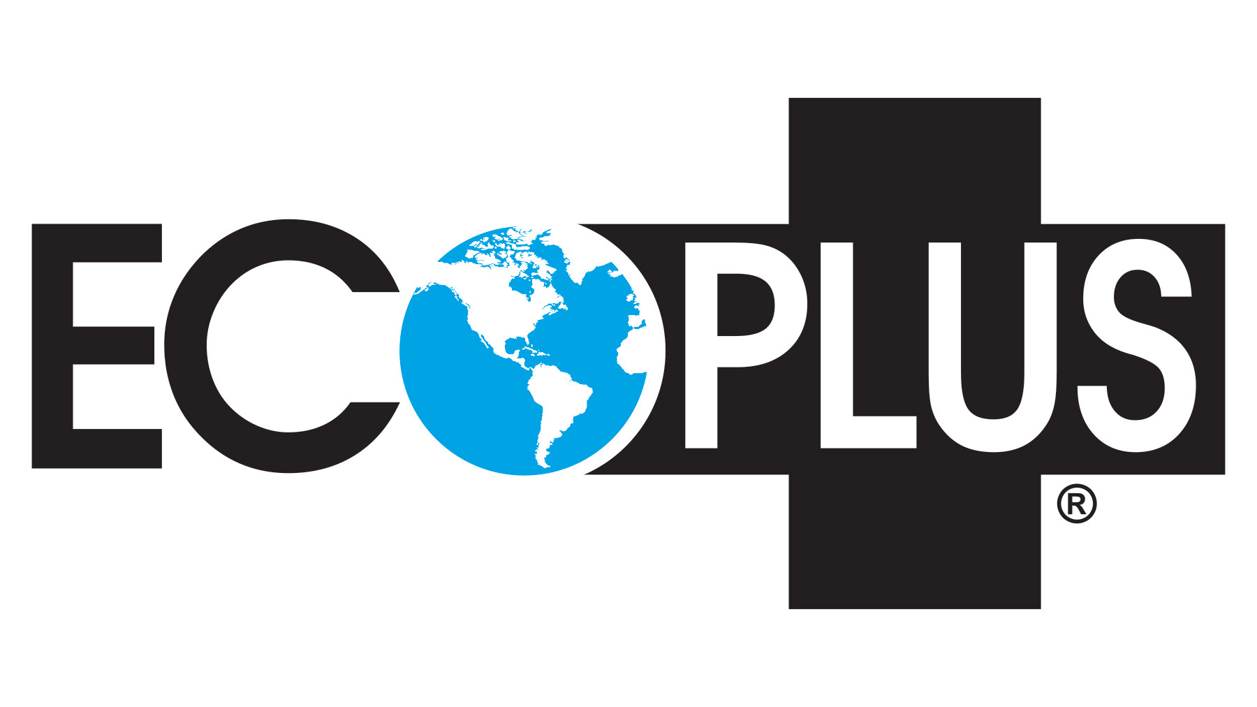
This is the new EcoPlus updated logo with the same feel, but simplified, which gives it a more modern look.
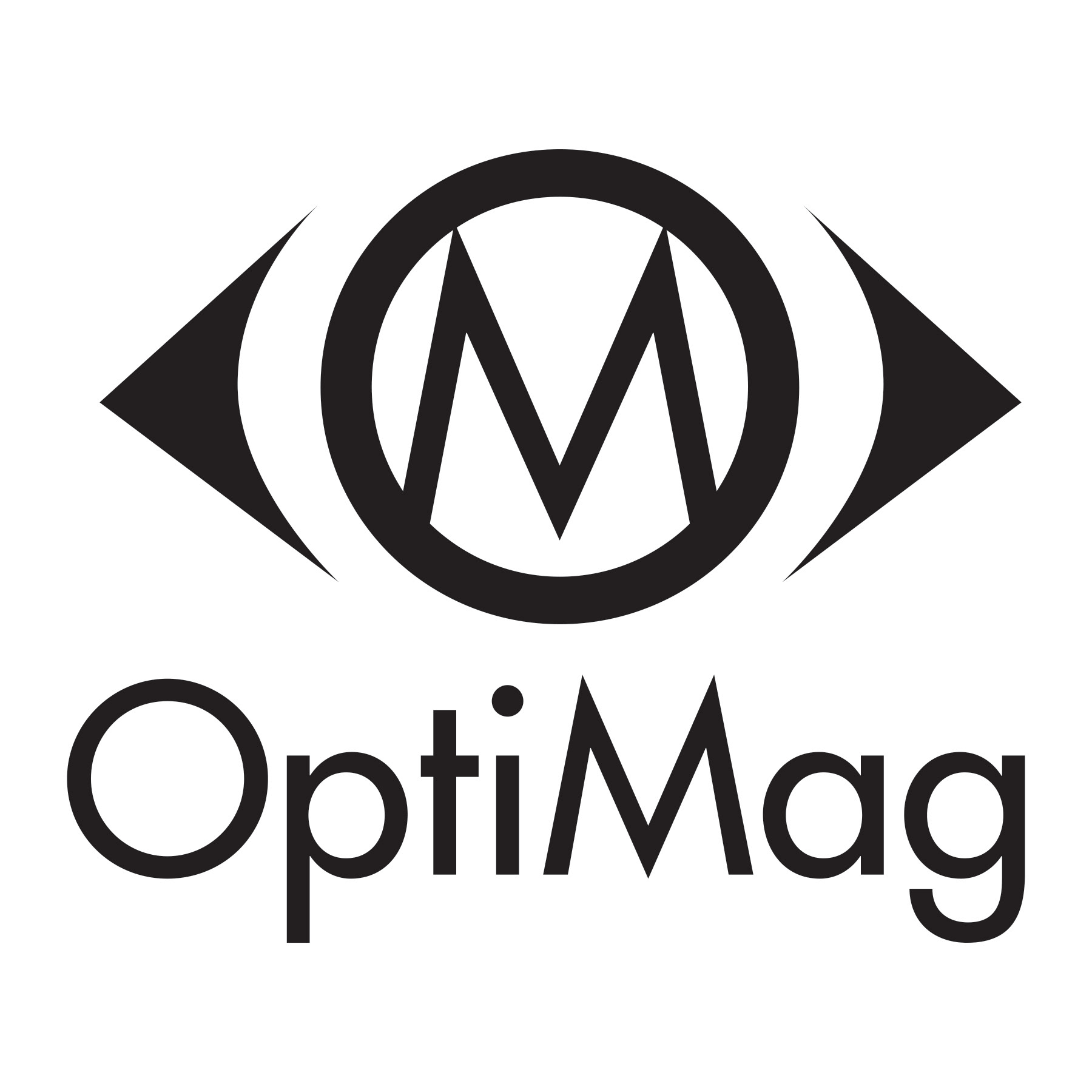
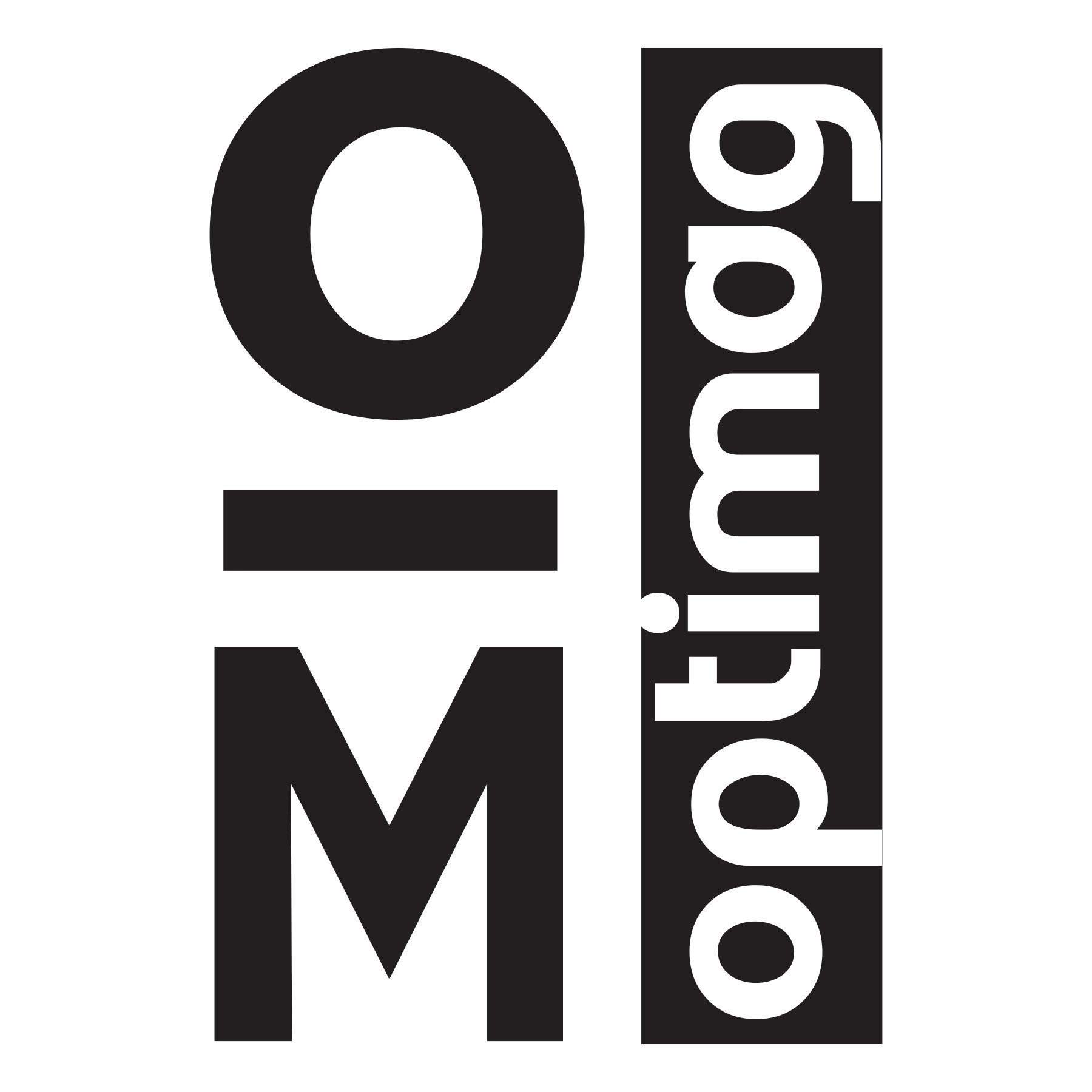
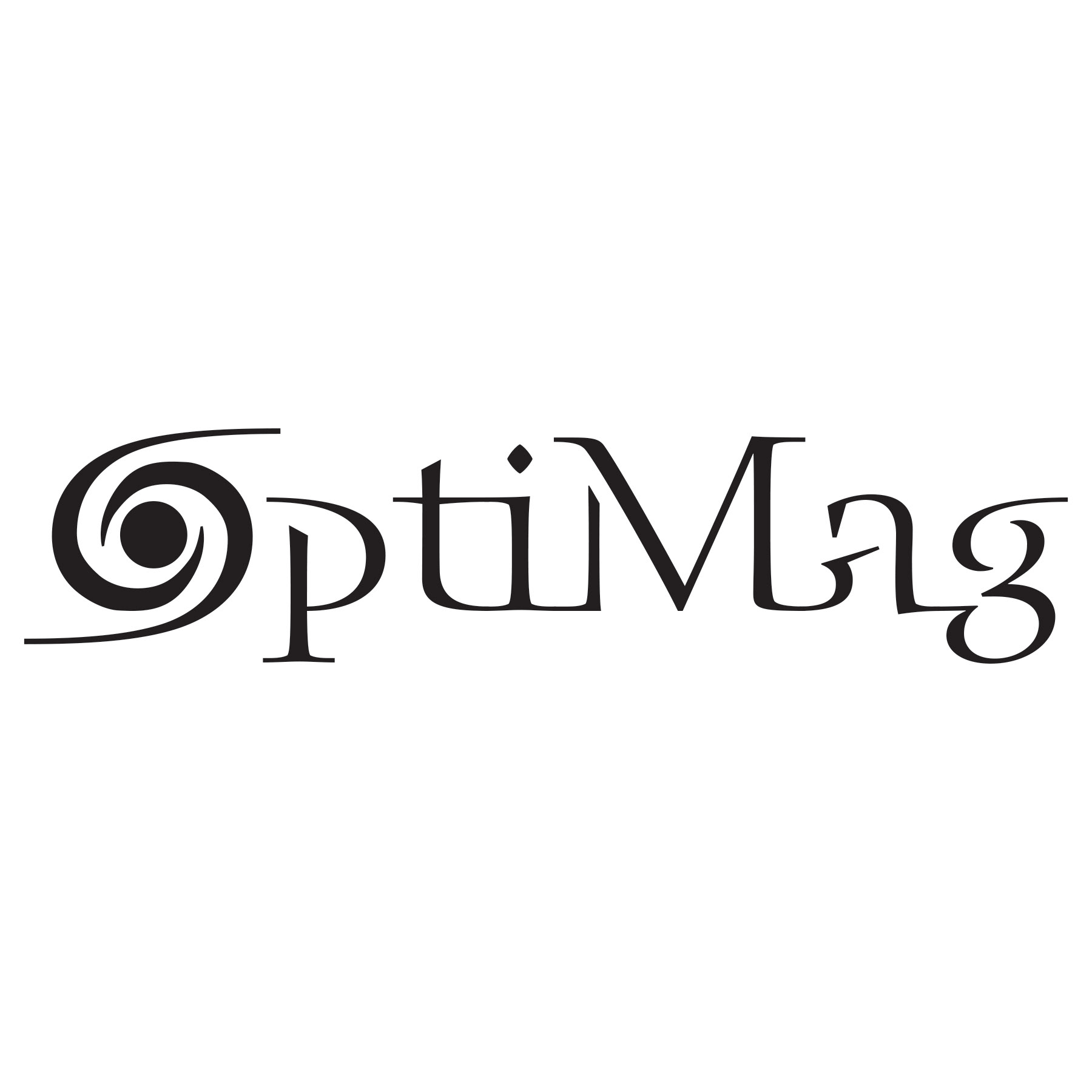
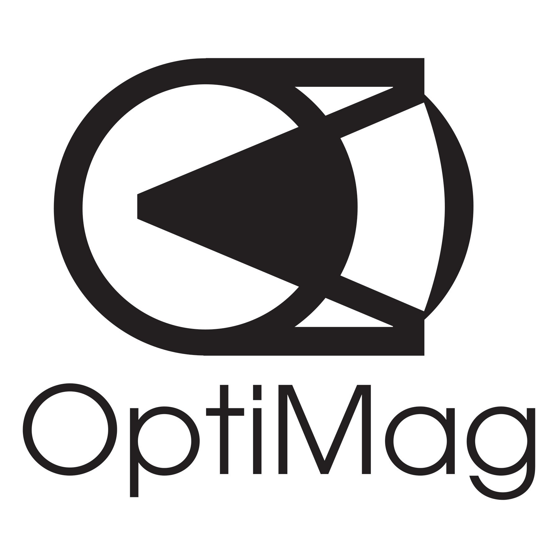
This was a new brand that Sunlight Supply decided add. This was a line of magnifying products. I created multiple concepts playing off the concept of vision or eyes. The one on the left was chosen, but the company chose not to move forward with the brand. The logos to the right are some of the other concepts that were not chosen.
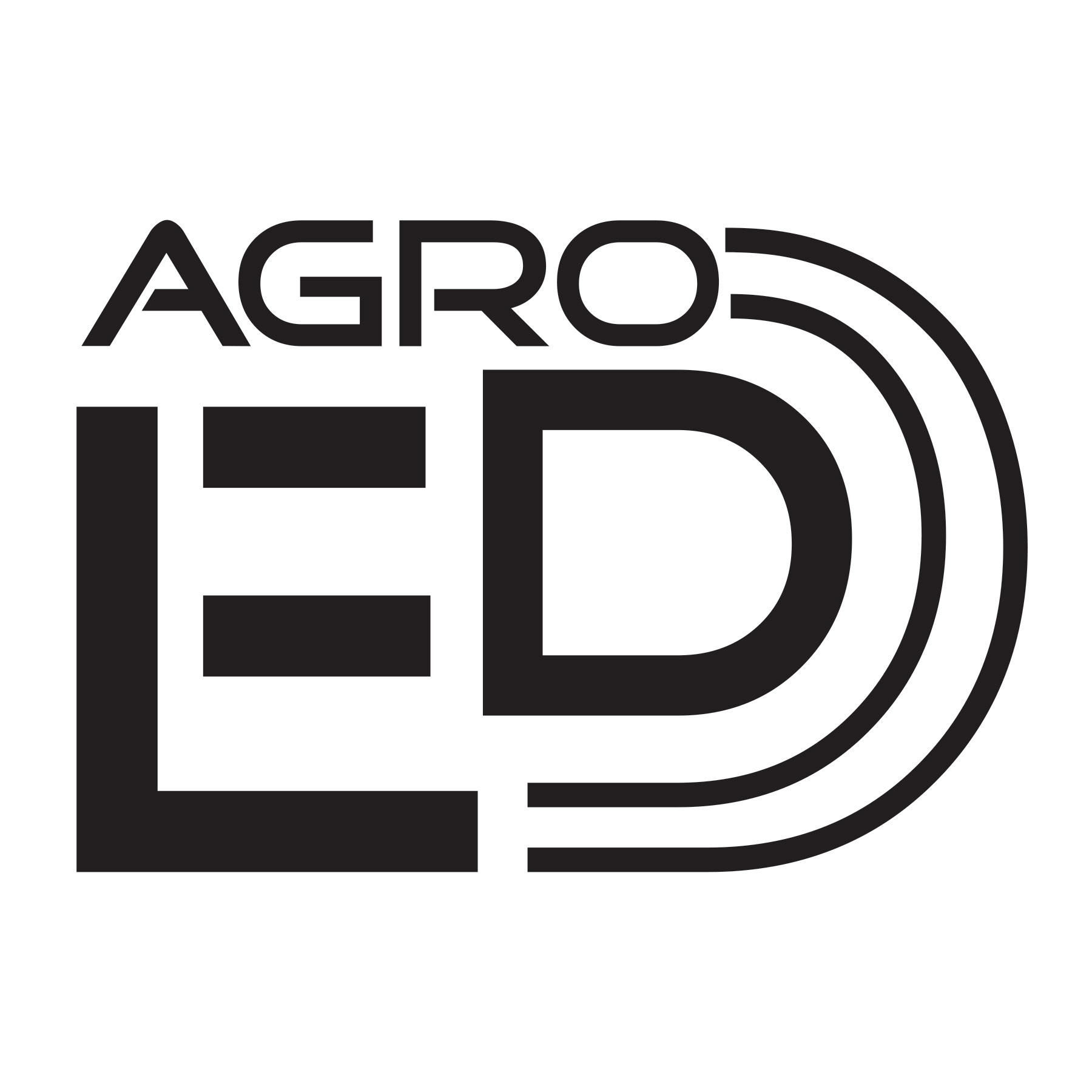
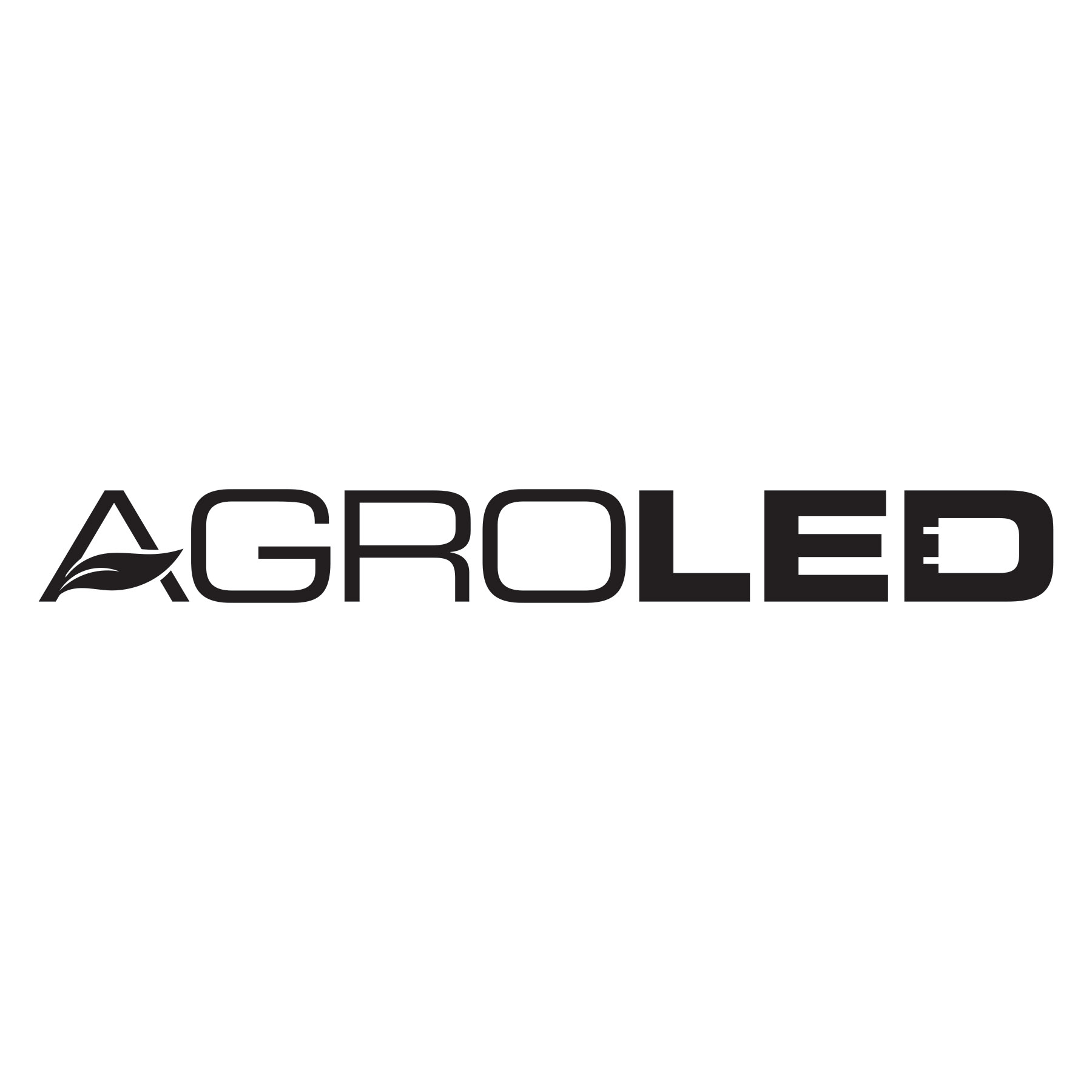
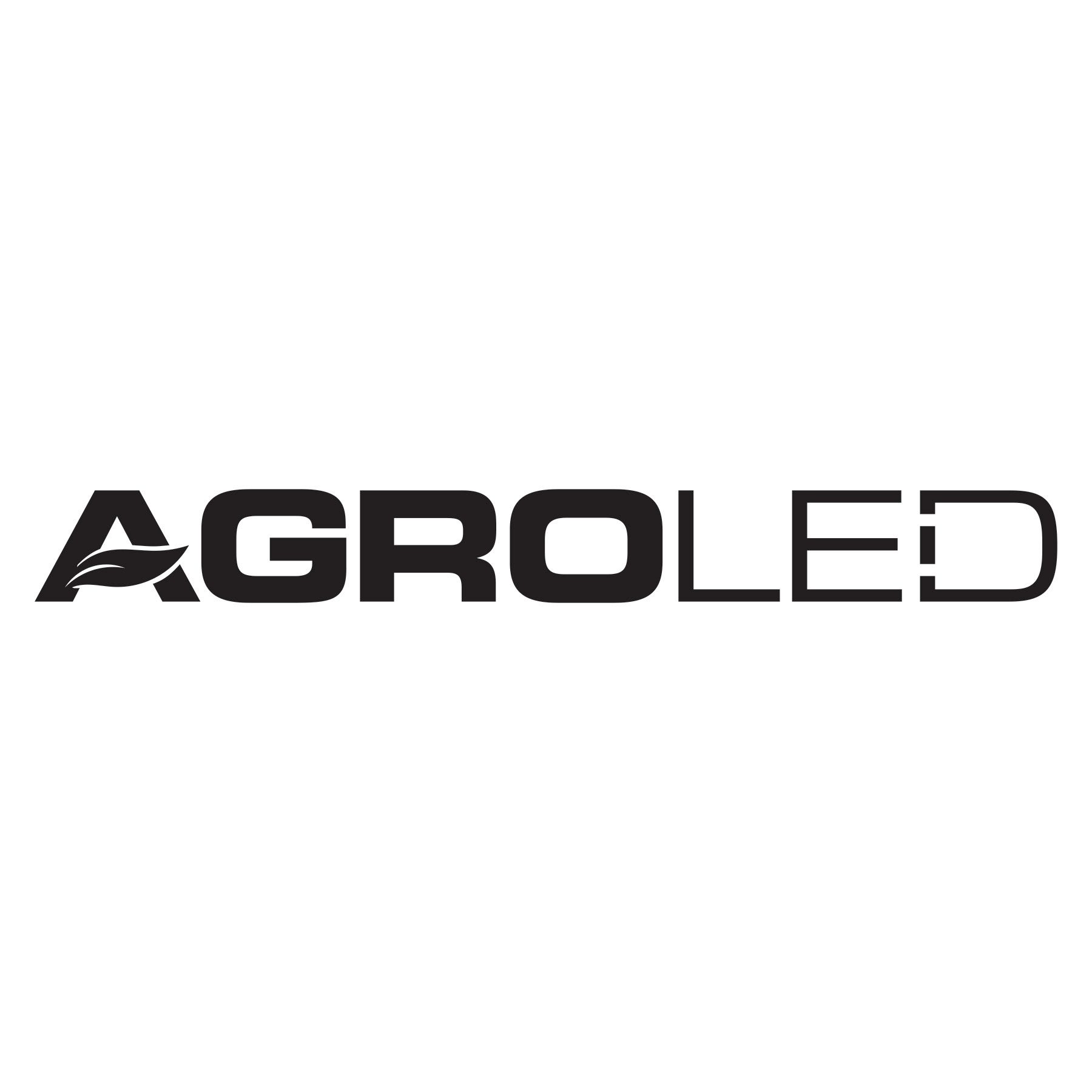
These are logo ideas for a brand of LED lighting. This was a product line of grow LED lights for all stages of growth, with the best value for lumens per watt in the industry. I was playing with the shape of the actual LED diode shape. The D shows the LED diode as well as the E and D together.
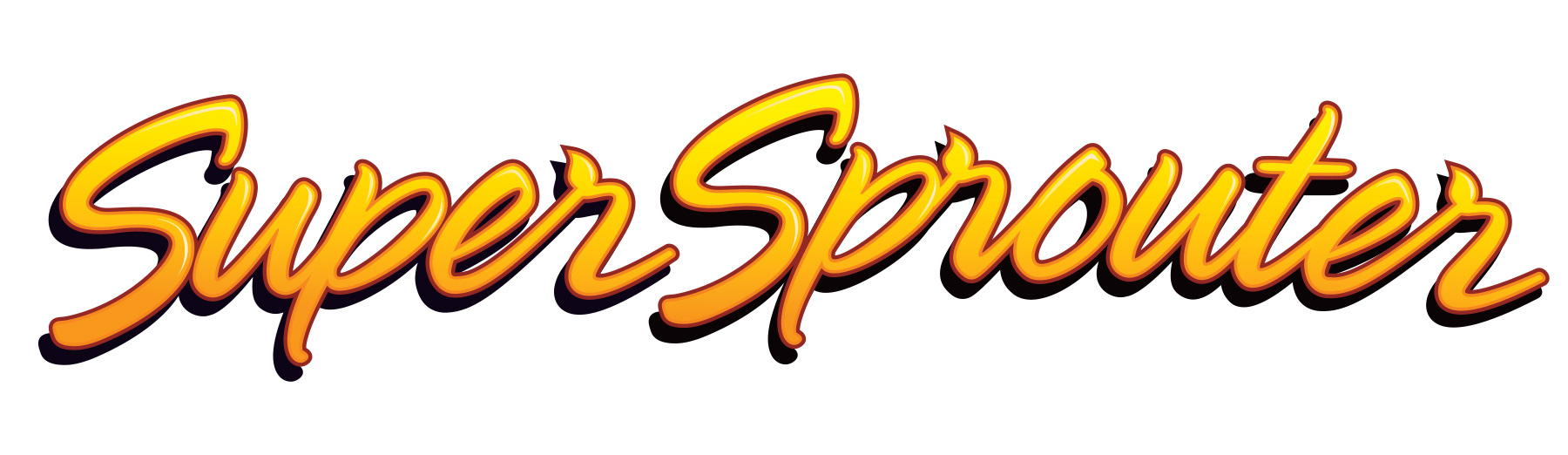
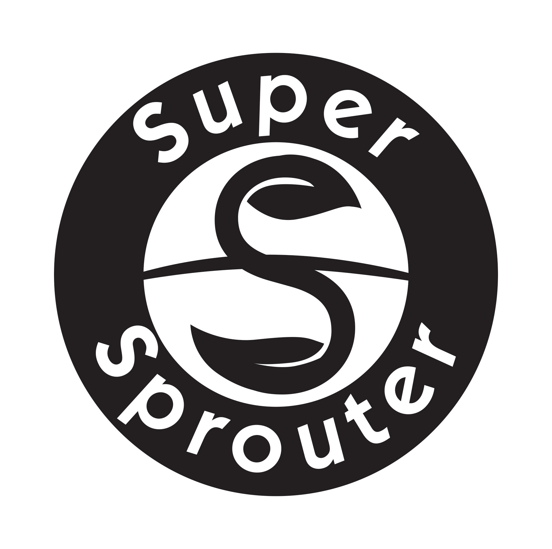
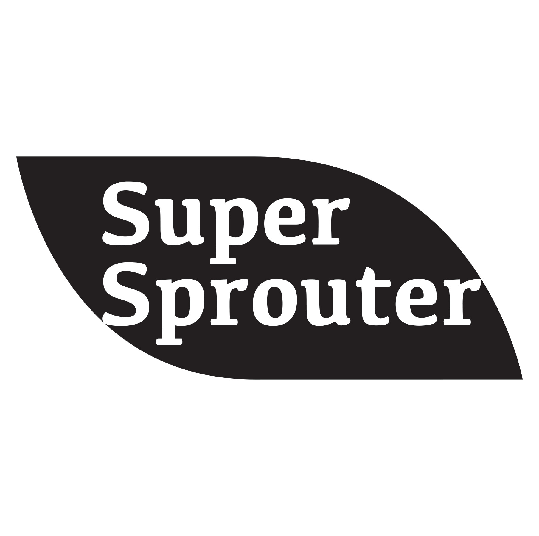
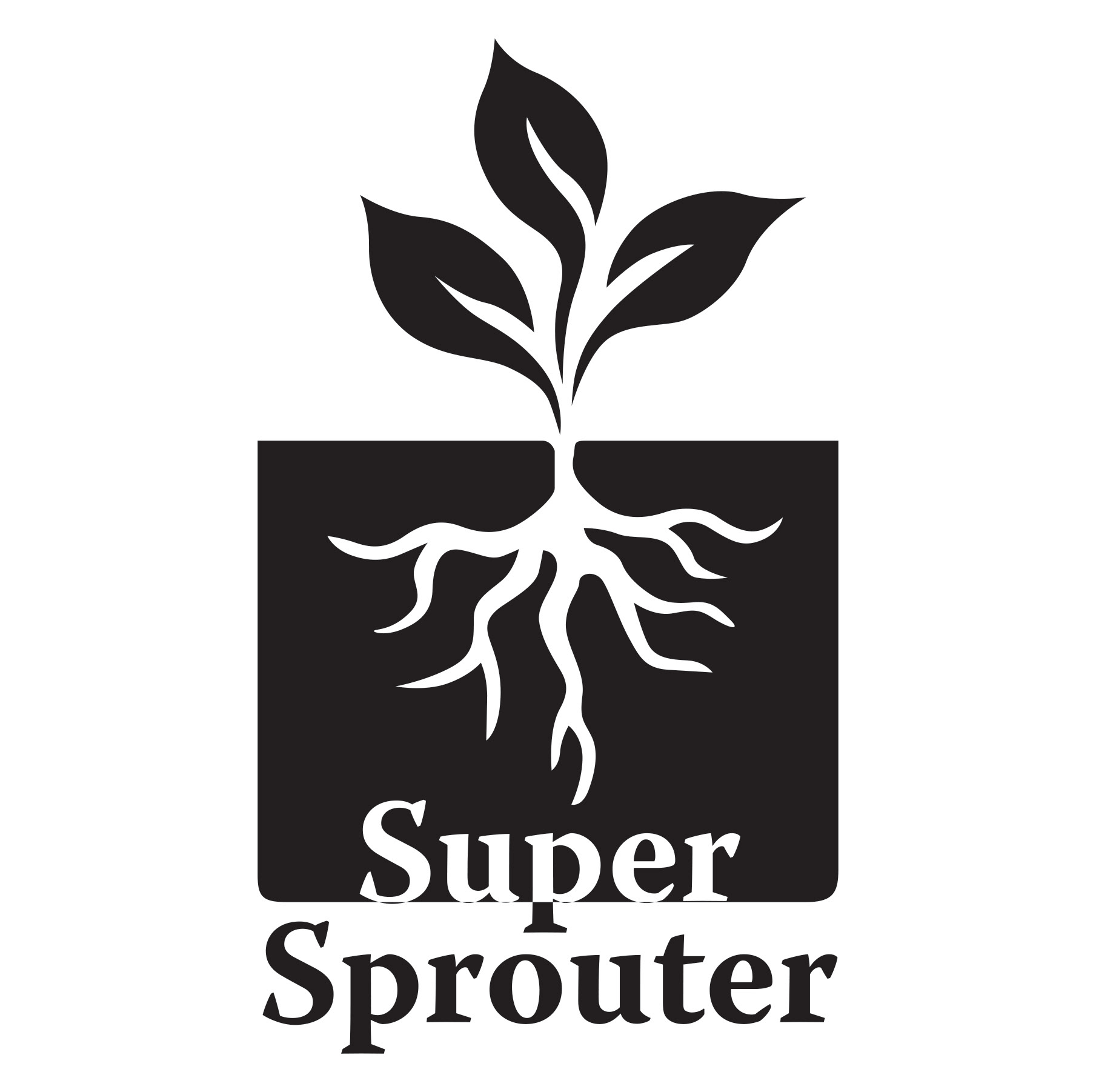
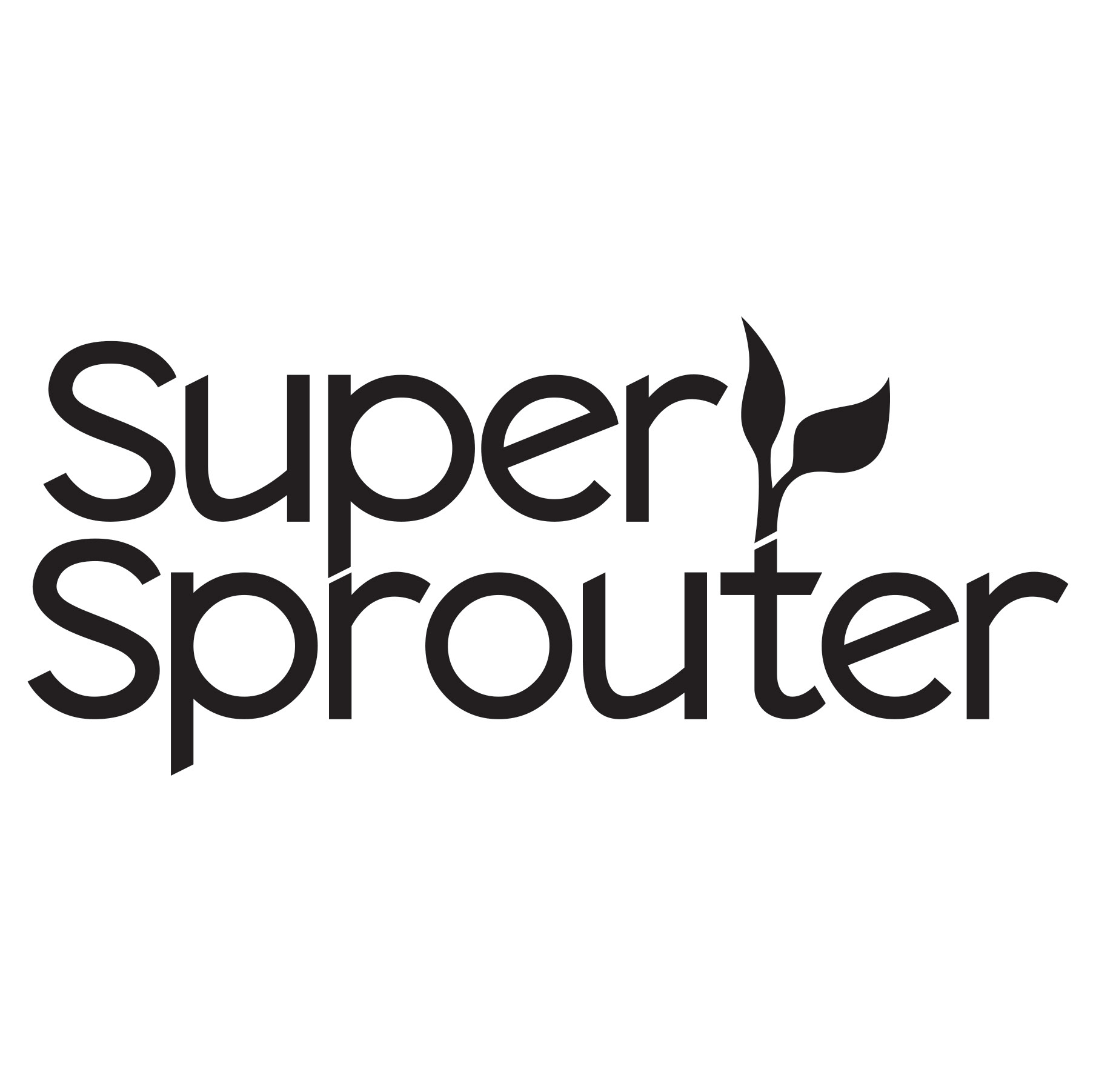
The first Super Sprouter full-color logo is an original logo for Sunlight Supply. The product line needs a full brand refresh for Super Sprouter. The black and white logos are concepts that I came up with for the brand.
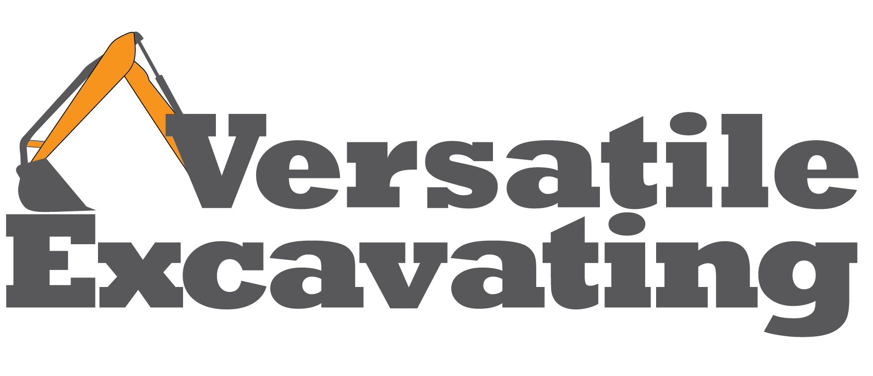
Logo created for a local excavating business. I tried to create a bold and simple logo to be visible from far away.
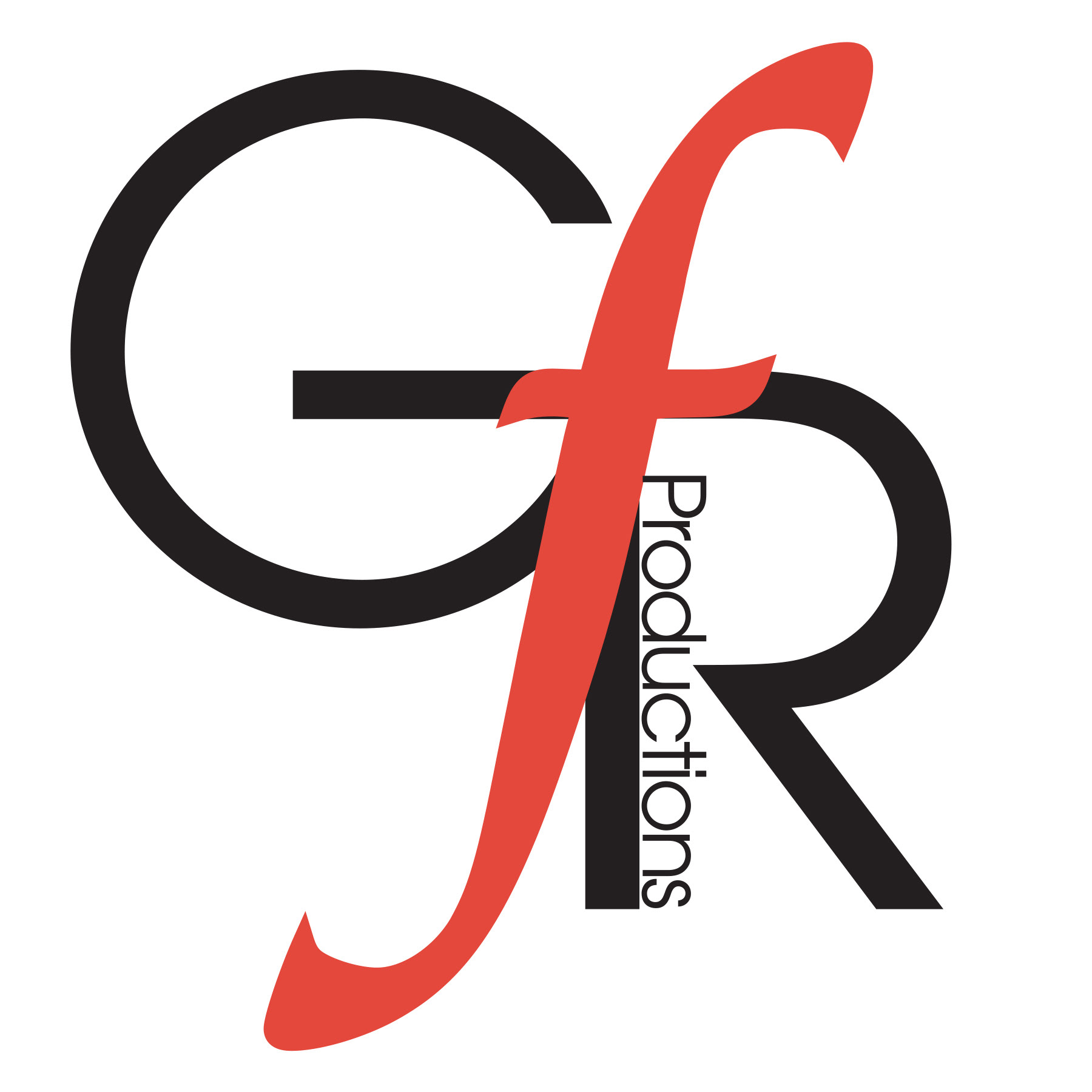
Created a sophisticated 2-color logo and corporate identity for a new production company. I played with contrasting typography.